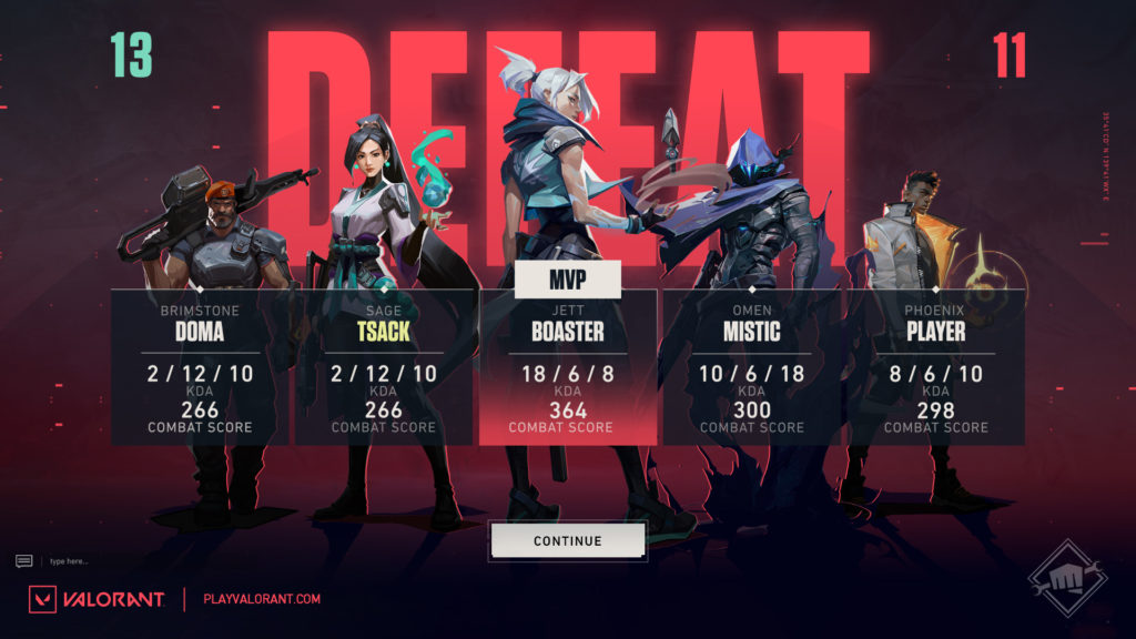
VALORANT Patch 5.08 saw some significant changes to Riot’s multiplayer tactical shooter, namely in the addition of the latest controller agent, the water-bending Harbor. The most noticeable change outside of the new agent was a new menu interface and new screens for the main menu, lobby, pre-game, and end-game.
The goal of the UI updates, from Riot’s perspective, was to limit the amount of clutter on screen while giving more attention to player cards. But while the visual improvements certainly look nice, one result of the interface changes didn’t sit well with fans.

The changes added more steps to menu navigation, requiring players to back out of the menu section they were in completely before navigating to a new one. Players were not happy with the extra steps necessary to switch between pages, so Riot is planning a fix.
“What we are seeing is that maybe the updated navigation scheme adds a few more steps than you’d like,” Riot member RiotZulu wrote on the VALORANT subreddit. “For now, we are planning on a change for Patch 5.10 that will restore most of the more convenient one-click access to menus around the game until we can work to build the best longterm navigation update.”
This update should permit VALORANT players to be able to switch between their career page, their collection, and the lobby with a single click.
RiotZulu also reiterated that the original UI changes are the first step in a longer process that “bring motion design and overarching visual polish throughout the game.” Some of these new updates could ship before the end of the year.


